
米マイクロソフトは現地時間の23日、自社のロゴを25年ぶりに一新したと発表しました。TechNet Blogsも更新されています。
It’s been 25 years since we’ve updated the Microsoft logo and now is the perfect time for a change. This is an incredibly exciting year for Microsoft as we prepare to release new versions of nearly all of our products. From Windows 8 to Windows Phone 8 to Xbox services to the next version of Office, you will see a common look and feel across these products providing a familiar and seamless experience on PCs, phones, tablets and TVs. This wave of new releases is not only a reimagining of our most popular products, but also represents a new era for Microsoft, so our logo should evolve to visually accentuate this new beginning.
via TechNet Blogs
ロゴ変更の理由について、マイクロソフトは2012年が「Windows 8」や「Windows Phone 8」新しい「Xboxサービス」や「Office」の発表の年となったことをあげています。

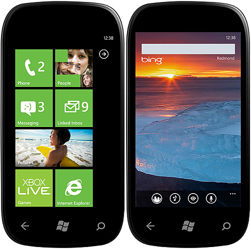
2012年2月に発表されたWindows 8のロゴはWindowsの原点に立ち返った形となっており、マイクロソフトのロゴもこれに合わせた格好になります。新しいWIndows 8の評価はまだまだ聞こえては来ませんが、ゆくゆくはこのロゴもなじんでいくことになるのでしょうか。

- マイクロソフトで学んだこと、マイクロソフトだからできること。
- 樋口 泰行
- 2011/05/02
- 1,680 円
- (価格情報は 2012/08/24 現在のものです)
- Amazon.co.jp で詳細を見る